

Google changes its iconic “G” logo for the first time in 10 years
Since 2015, Google’s multicolored “G” had not moved. In 2025, the American firm softens the contours and merged its four historical colors into a more expressive gradient. Already visible in the Google IOS App, this graphic evolution could prefigure a broader transformation of the visual identity of the Californian giant.
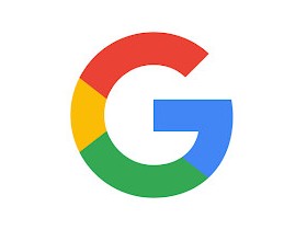
New “G” logo: Google opts for a subtle and more modern gradient
No more net borders between colors. Google’s new “G” now lets red slide towards yellow, yellow melts in green, and green dissolve in blue. A graphic choice that gives the logo a more vibrant, almost organic aspect, like animations and visual effects of Gemini, his assistant doped at AI.
This update, already active in the Google on iOS application, is not yet generalized on Android or on the web. The main “Google” logo, composed of the six letters, remains unchanged (for the moment). But this first step could announce a broader overhaul of all the iconography of the group, especially for products like Chrome or Maps, which share the same palette.
Google offers an application and service that allow you to carry out practical and effective research for your smartphone, tablet, computer, etc. An undeniable search engine.
- Downloads:
345 - Release date:
05/12/2025 - Author :
Google LLC - License:
Free license - Categories:
Internet
- Operating system:
Android, online service, Windows 10/11, iOS iPhone / iPad


